Stochastic Nonsense

Put something smart here.

Filled Line Plots / Graphs in R -- Part 10 in a Series

This is post #10 in a running series about plotting in R.

Otherwise known as filled curves.

Say you want to, instead of drawing a single line, draw a filled curve. R’s basic plot doesn’t make the especially easy, though it can be made much easier with packages such as ggplot2 as we’ll see in a week.

In any case, the basic trick is to draw polygons on the screen. You have to manually specify the bounds of the polygon, but this isn’t hard: for the first filled curve, the bottom is the X axis, probably 0..0, and the top is is the desired height of your curve. The trick is you specify these points on the polygon as linearly connected segments, so you have to go left to right then right back to left. Let’s do this with the Yahoo data and overlay our moving average as a single line. Load our yahoo2 data as in part 6:

1
2
3
4
5
6
7
8
9
10
> # create a X series that goes left to right then right back to left
> xx <- c(yahoo2$date, rev(yahoo2$date))
> #
> yy <- c(rep(0, nrow(yahoo2)), rev(yahoo2$close))
>
> # call plot to create the plot, and plot the close data which will be overwritten with the polygon 
> plot(x=yahoo2$date, y=yahoo2$close, col='red', type='l', ylim=1.1*c(0, max(yahoo2$close30)))
>
> polygon(xx, yy, col='red')
>points(x=yahoo2$date, y=yahoo2$close30, col='black', type='l', lwd=2)

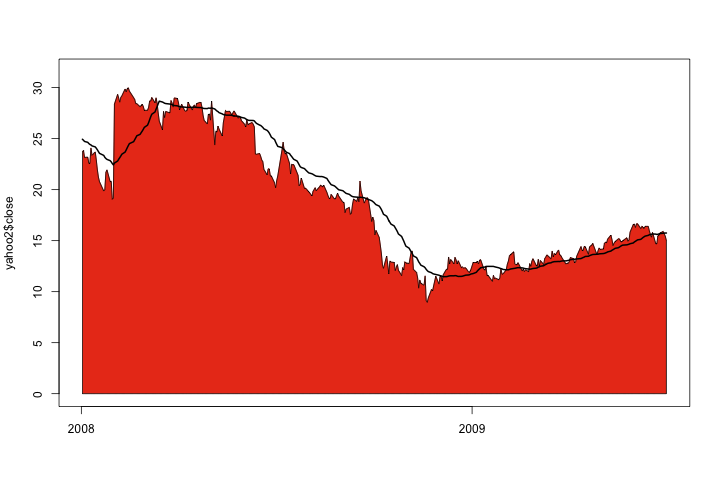
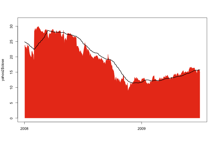
Unfortunately, the black border created by polygon almost overshadows the black line of the moving average. It can be removed by setting border=NA when calling polygon:

1
2
3
> plot(x=yahoo2$date, y=yahoo2$close, col='red', type='l', ylim=1.1*c(0, max(yahoo2$close30)))
> polygon(xx, yy, col='red', border=NA)
> points(x=yahoo2$date, y=yahoo2$close30, col='black', type='l', lwd=2)

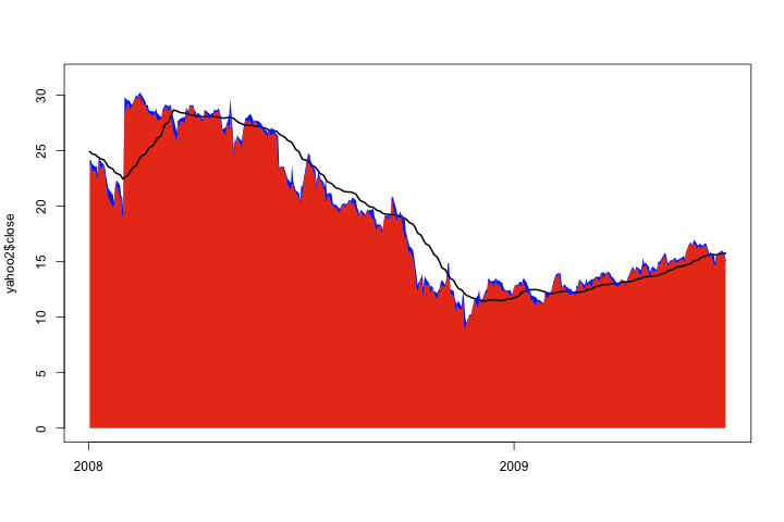
Now, let’s stack two filled line plots. The trick is for the second series, when we create it’s polygon, to use the height of the first polygon instead of zero for the bottom. This doesn’t work particularly well visually, but I think does demonstrate the technique.

1
2
3
4
5
6
7
8
9
10
11
> # create first polygon
> xx <- c(yahoo2$date, rev(yahoo2$date))
> yy <- c(rep(0, nrow(yahoo2)), rev(yahoo2$close))
>
> plot(x=yahoo2$date, y=yahoo2$close, col='red', type='l', ylim=1.1*c(0, max(yahoo2$close30)))
> polygon(xx, yy, col='red', border=NA)
> points(x=yahoo2$date, y=yahoo2$close30, col='black', type='l', lwd=2)
>
> # create stacked high price
> zz <- c(yahoo2$close, rev(yahoo2$high))
> polygon(xx, zz, col='blue', border=NA)

Finally, let’s tidy up a bit, properly label our axes, and zoom the data in a bit:

1
2
3
4
5
6
7
8
9
10
11
12
13
14
15
16
17
18
19
> plot(x=yahoo2$date, y=yahoo2$close, col='red', type='l', xaxt='n',
+     main='YHOO stock close', xlab='date', ylab='close ($)')
> polygon(xx, yy, col='red', border=NA)
> 
> polygon(xx, zz, col='blue', border=NA)
> points(x=yahoo2$date, y=yahoo2$close30, col='black', type='l', lwd=2)
> 
> # put X axis labels on first date present in each quarter
> locs <- tapply(X=yahoo2$date, FUN=min, INDEX=format(yahoo2$date, '%Y%m'))
> 
> at = yahoo2$date %in% locs
>  
> at = at & format(yahoo2$date, '%m') %in% c('01', '04', '07', '10')
> axis(side=1, at=yahoo2$date[ at ],   labels=format(yahoo2$date[at], '%b-%y'))
> abline(v=yahoo2$date[at], col='grey', lwd=0.5)
> 
> legend(x=as.Date('2008-12-01'), y=27, 
+     legend=c('YHOO daily close', 'YHOO daily max', 'YHOO 30 day ma'), 
+     col=c('red', 'blue', 'black'), fill=c('red', 'blue', NA), lwd=c(0, 0, 1))