Frequently, you want to plot data that is not at all on the same scale. In R, this is done via plotting a second graph on top of your first and building the axes labels by hand. Here’s a rough outline:
1 2 3 | |
With that in mind, let’s continue our long running example and plot both YHOO and GOOG stock prices on the same graph, along with moving averages for both.
Here, again, are both data series: google data and yahoo data.
First, let’s prep our google data:
1 2 3 4 5 6 7 8 9 10 11 12 13 14 15 16 17 18 | |
This is exactly how we prepped the yahoo data.
Initially, let’s just try plotting both sets of series on the same scale and see what happens.
1 2 3 4 5 6 7 8 9 | |
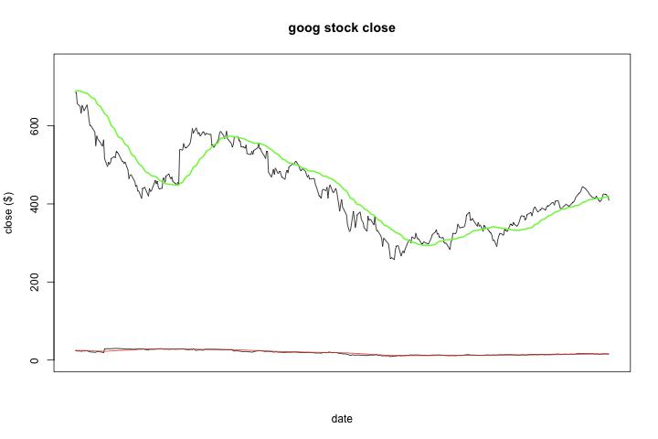 While we did get all four time series onto the same plot, the yahoo data is so squashed that you can’t really tell what’s going on.
So let’s try the above approach and create independent scales / Y axes for the two sets of time series:
1 2 3 4 5 6 7 8 9 10 11 12 13 | |
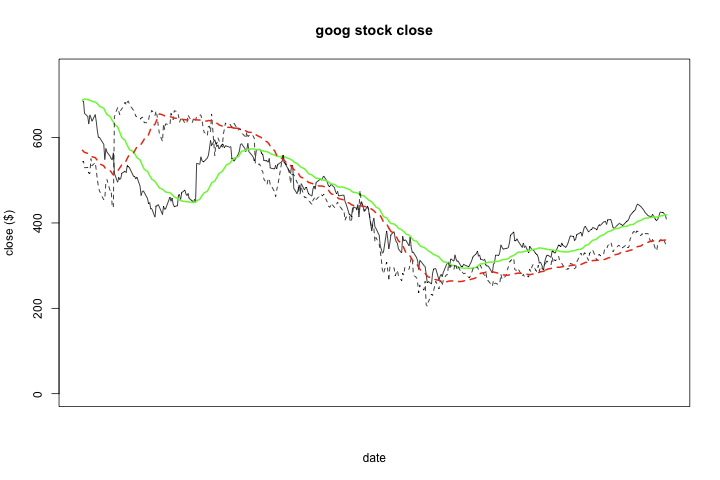 I attempted to use dashed (lty=2) instead of solid lines to differentiate the two sets of data, but it’s clearly not a good outcome. Instead, let’s color both time series — the daily observations and the moving average — the same colors for each stock, and rely on line width to differentiate within stocks. I also switched blue for green for Google as it shows up much better. You can pass a col parameter to the axis functions, so let’s set the axis line and tick marks to the same color as our series to help associate the series with their proper scales.
1 2 3 4 5 6 7 8 9 10 11 12 13 14 15 16 17 | |
This is definitely an improvement — you can see the differences in the two stocks, and the lines can easily be visually distinguished. Nonetheless, the blue color of the left axis is pretty faint, the red color of the right axis is left intuitive than I would have liked, and the tick marks not only are on different scales but occur with much different frequency. The last is an unfortunate side effect of how pretty, an R function used to attempt to pick out nice values, works.
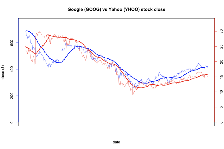
So for our final plot, I decided to create nicer tick values by hand. If you look at the maxima of the two series, you’ll note that you can round them up a little and pick a set of numbers with a nice ratio. So I’ll adjust the two scales so that each tick for google is 35 times the same yahoo tick.
1 2 3 4 5 6 | |
I’m also going to stick both Y axes on the left to really help distinguish between the two stocks, and in doing so, I’ll have to manually move the Y axis label out farther to accommodate. This can be accomplished with the oma, or outer margin, parameter to par. I’ll also bring back the fancy X axis labels from part 6 of this series.
1 2 3 4 5 6 7 8 9 10 11 12 13 14 15 16 17 18 19 20 21 22 23 24 25 26 27 28 29 30 31 32 33 34 35 36 37 38 39 40 41 42 43 | |

I think this plot came out much better. On the left hand side, the contrast between the two scales is clear, and the tick marks neatly line up. You can also clearly see the percentage change in the two stocks mirrored each other. My last nitpick is that an inch could be reclaimed from the bottom of the plot by not showing a data range where the stocks never venture, but I kind of like that you really get a good sense of the range of the data relative to the lower bound, zero.