You regularly want to label pieces of a plot in order to point a particular feature out or answer a question that your audience will have. Let’s see how to do this in R.
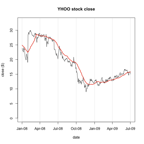
First, let’s collapse all the R source we need to get to the plot we had at the end of part 5 – axis labeling.
1 2 3 4 5 6 7 8 9 10 11 12 13 14 15 16 17 18 19 20 21 22 23 24 25 26 27 28 29 30 31 32 33 | |

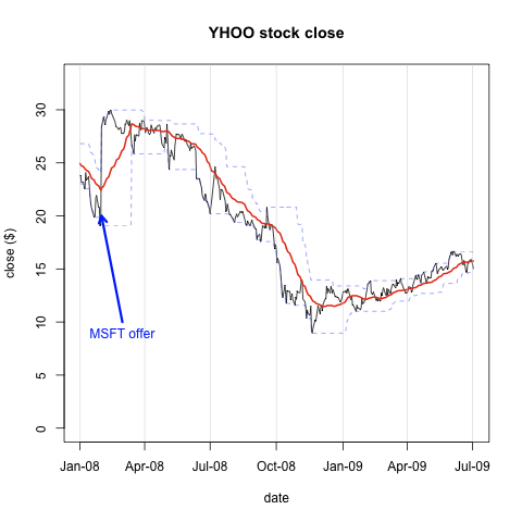
First, let’s look at the dramatic jump in the stock price on the first of February 2008 — Microsoft announced their takeover bid for Yahoo. We can annotate our plot with that text, and even draw an arrow to our series. Note that the x,y locations specified in all these functions are in whatever coordinate system you passed into the plot function.
1 2 3 4 | |

Finally, more for demonstration than anything else, let’s plot the 30 day moving min and max of the close price. To distinguish these two series, I’ll use dashes instead of solid lines and make the lines very light. First, I’ll create functions to calculate the respective series. The lty param to points controls the line type, in this case dashed, and lwd less than one is a very narrow line.
1 2 3 4 5 6 7 8 9 10 11 12 13 14 15 | |

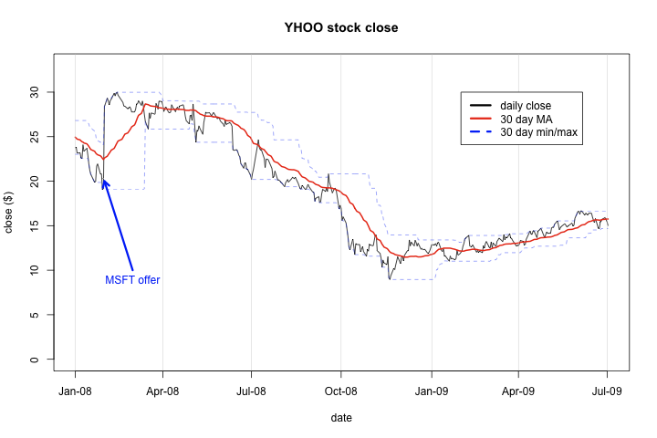
And finally, we should add a legend just to make very clear what is going on in our plot. Note that lty allows you to set the line type — normal or dashed — for each legend item. I also used png with width=720 and height = 480 to stretch the plot out for better viewing.
1 2 3 | |
