There are a variety of ways to control how R creates x and y axis labels for plots. Let’s walk through the typical process of creating good labels for our YHOO stock price close plot (see part 4).
Reviewing our plot from last time, we left off with code that plots two line series in different colors and different line widths.
1 2 3 4 | |

Unfortunately, while R understands our X axis data as dates, it doesn’t choose optimal labels for our purposes.
Instead, let’s try labeling the first day of the month in each business quarter. To do this, we use the format function on dates to pick out the first (day 01) of every month, and select months 1,4,9, and 12 for the business quarters. Note that R allows us to use the %in% operator to ask if a value is contained in a vector. Further, note that format produces text, not numeric values, so we have to match the results against an array of strings.
1 2 3 4 5 | |
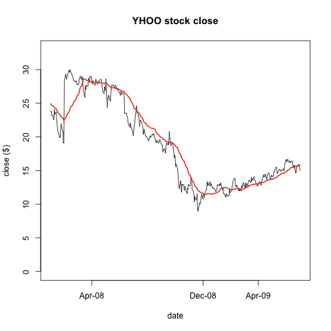
Which is a little disappointing — we’re only left with three data values. Nonetheless, let’s see what it looks like:
1 2 3 4 5 6 7 8 9 | |
Which produces

Walking through the code, in the plot call, we use xaxt='n' to tell plot not to create X axis labels. The format command asks which dates are in the months (1,4,7,10) that start quarters, and the second format command asks which days are the first of the month. You’ll note that we don’t have many dates on our graph — that’s because often, the first day of the month isn’t in our data! Only 3 days in the data are both on the first and the beginning of a new quarter.
Instead, let’s just find the first day of each month that is present in the data:
1 2 3 4 5 6 7 8 9 10 11 12 13 14 15 16 17 18 19 20 21 22 23 24 25 26 27 28 29 | |
tapply is an extraordinarily handy R function that runs a user supplied function, in this case min, on data, returning one value for each unique level of the factor supplied in INDEX. When we print loc, the first column is our unique factor — a combination of year and month — and the second column is the minimum date value for that factor. We then select select the first dates in each month and further select just those months that are the beginning of new business quarters:
1 2 3 | |
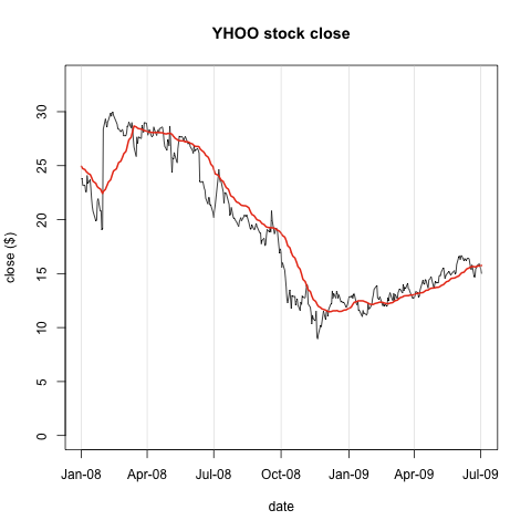
Finally, we bring this all together to plot the data and format the X axis to show the first date in each quarter, adding vertical lines to draw the eye to the quarter divisions.
1 2 3 4 5 6 7 8 9 | |
