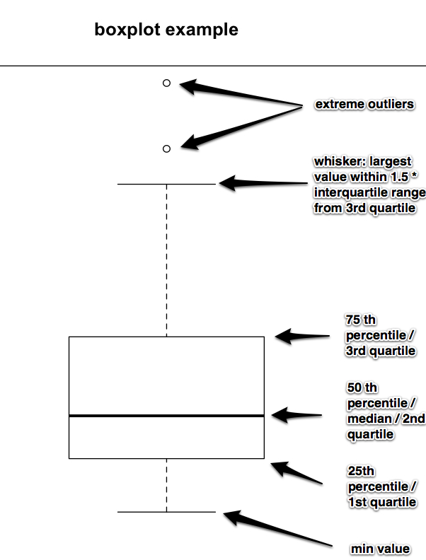
As generated by R’s boxplot function. I individually labeled the median, quartiles, min, max, and outliers for inclusion in a presentation where the audience can’t be assumed to know how to interpret box plots. Please feel free to use this image if you have a similar need.
In text, shamelessly stolen from the climate blog:
The rectangle shows the interquartile range (IQR); it goes from the first quartile (the 25th percentile) to the third quartile (the 75th percentile). The whiskers go from the minimum value to the maximum value unless the distance from the minimum value to the first quartile is more than 1.5 times the IQR. In that case the whisker extends out to the smallest value within 1.5 times the IQR from the first quartile. A similar rule is used for values larger than 1.5 times IQR from the third quartile. A special symbol shows the values, called outliers, which are smaller or larger than the whiskers