Stochastic Nonsense

Put something smart here.

Interactive Plotting in R

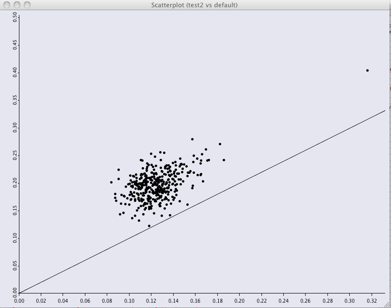
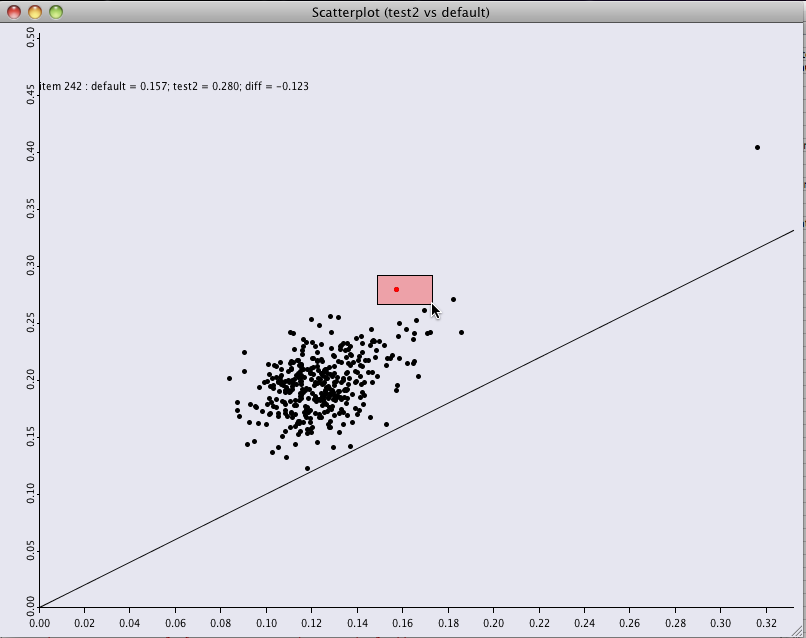
There are many ways to compare univariate distributions; one of my favorites is violin plots. However, if you are only comparing two distributions, then the best solution is often a scatter plot. To that end, I’ve build some code that creates an interactive scatter plot of two distributions and allows you to interactively print arbitrary strings on the graph when you select / deselect points. This creates a slightly kludgy but very handy tool for hand comparing distributions.

Unfortunately, truly interactive plotting isn’t really a part of R and you are thus forced to lean on external tools. I picked JGR, the java gui for R. This is best used by getting the JGR launch tool.

Basically, I have data with multiple tests; a single line shows the results for one item across several tests. I wish to compare the distributions.

1
2
3
4
5
6
7
8
> head(age)
name    default      test1      test2
1 item 1 0.02110710 0.01900870 0.02030870
2 item 2 0.03160770 0.02926650 0.03345660
3 item 3 0.03909570 0.03702500 0.04016650
4 item 4 0.00262195 0.00225917 0.00302822
5 item 5 0.01668860 0.01555010 0.01783400
6 item 6 0.04223370 0.03904630 0.04123270

test data

You can use this function to throw up a window, and allow you to draw a box around items to see their information displayed in the upper left.

1
2
3
4
5
6
7
8
9
10
11
12
13
14
15
16
17
18
19
20
21
22
23
24
25
26
27
28
29
30
31
32
33
34
35
36
37
38
39
40
41
42
43
44
45
46
47
library('iplots')

visCompare <- function(dat, xname, yname){

  # override this to display your preferred text
  makeDispString <- function(row){
    sprintf('%s : %s = %0.3f; %s = %0.3f; diff = %0.3f', row$name,
      xname, row[[xname]], yname, row[[yname]], row[[xname]] - row[[yname]])
  }

  ypoint <- 0.05 + max(dat[[yname]])

  iplot(x=dat[[xname]], y=dat[[yname]], xlab=xname, ylab=yname,
    ylim=c(0, ypoint + 0.05), xlim=c(0, max(dat[[xname]])), lwd=2)

  iabline(coef=c(0,1))
  d <- iplot.data()
  cat('Select break from the menu to exit loop')

  txtObj <- NULL

  while (!is.null(ievent.wait())){
    if (iset.sel.changed()){
      cat("sel changed\n")
      s <- iset.selected()

      if (length(s) >= 1){
        if (!is.null(txtObj) ){
          iobj.rm( txtObj )
        }

        aa <- paste( makeDispString(dat[s[1:min(3, length(s))],]), collapse="\n")
        cat(paste(aa, "\n"))
        txtObj <- itext(x=0, y=ypoint, labels=aa)
      }

    } else {
      if ( !is.null(txtObj)){

        cat(paste('removing ', txtObj, "\n"))
        iobj.rm( txtObj )
        txtObj <- NULL
      }
    }

  }
}

To test, you can use these two bits of code:

1
2
3
4
5
6
7
8
9
if (F){
    read.csv(file='iplot.test.csv.txt', header=T, sep=',')
    visCompare(age, 'default', 'test2')
}
if (F){
    read.csv(file='iplot.test.csv.txt', header=T, sep=',')
    myDispFn <- function(a){ return(paste(a$name, 'blah blah', sep=' : ') }
    visCompare(age, 'default', 'test2', myDispFn)
}

And here are the results: first, a visual check via scatterplot of the differences of the two distributions:

and with the ability to highlight points and see what you’re looking at: