I regularly find myself wanting to show arrays or grids of plots in R. This is straightforward using par and mfrow as long as you want a symmetric, evenly spaced grid of plots. Unfortunately, this often is not what I want. Even more unfortunately, this is a hard question to google for. I’ve tried array of plots, grid of plots, matrix of plots, asymmetric grids of plots, asymmetric arrays, uneven grids of plots, uneven mfrow, uneven mfcol, etc, and nothing worked. (Searches listed here in the hopes that other people with the same question will find the answer.)
I actually didn’t think this could be accomplished without using lattice and ggplot2, but I recently discovered that it can be done with R’s base plotting functions. The function layout provides what we’re looking for. It takes a matrix describing where you want your sequence of plots to go. After creating your layout, you can use layout.show to visually see where your plots will go. Let’s take a look at some examples.
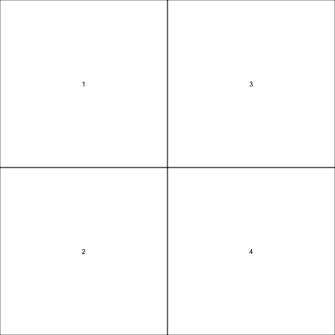
This creates a two by two grid, exactly as mfrow does.
1 2 3 | |

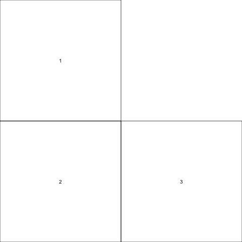
For comparison, this creates a 2 by 2 grid as mfcol does. The only difference is the order of the plot numbers in the matrix.
1 2 3 | |
We can put 0 in any position in the matrix to not plot there.
1 2 3 | |
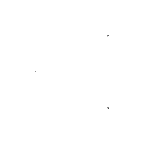
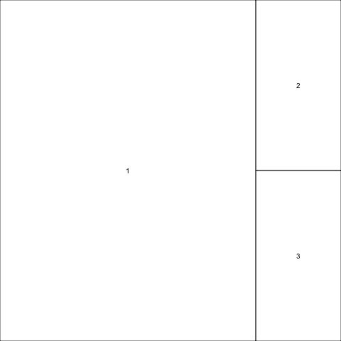
Now, let’s just have one plot use all of the left column. The trick to spanning columns like this is to repeat the number of the plot that you want to span — note that 1 occurs twice in the layout matrix.
1 2 3 | |
Finally, we can set widths for the columns (or for the rows — just use heights instead of widths).
1 2 3 | |
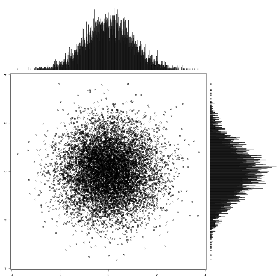
Now, let’s show off what I originally wanted to do: display a plot of two dimensions of a distribution, along with the marginal distributions. I’m wrapping the functionality up into a function so it’s easy to reuse. I use plot to show the sample and barplot to show the distribution as calculated by hist.
1 2 3 4 5 6 7 8 9 10 11 12 13 14 15 16 17 18 19 20 21 22 23 24 25 26 27 28 29 30 31 32 33 | |
Now that all the prep is done, this shows a multivariate normal distribution with no correlation between the two variables. Note the shape of the marginal distributions.
1 2 3 | |
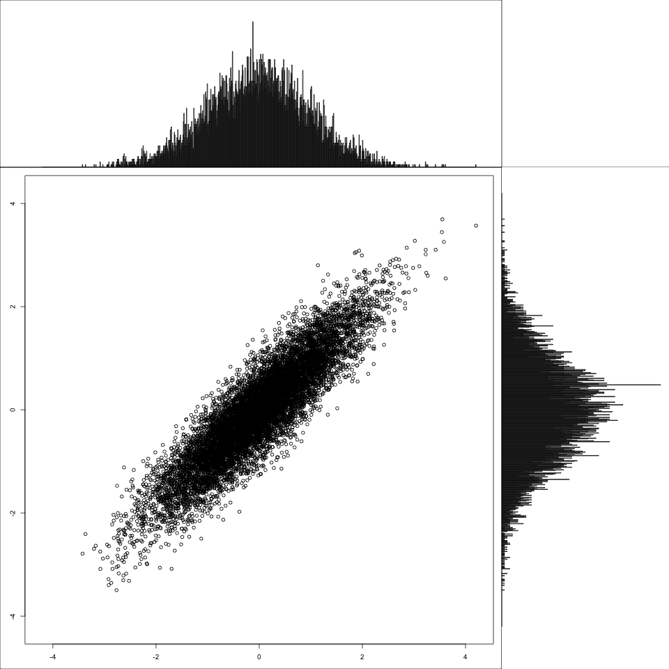
And finally, for contrast, a correlated multivariate normal.
1 2 3 | |