This is post #11 in a running series about plotting in R.
I often want to shade pieces of an R plot, in order to visually draw out some piece, such as weekends or recessions. Let’s look at how to do that with the plain plotting tools.
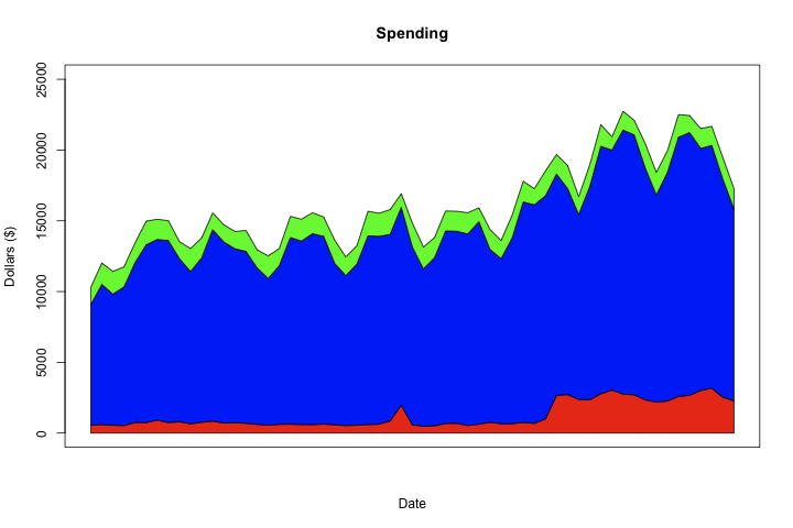
First, I have some obscured data from work. I’m going to take 3 series and turn them into stacked filled line plots. But first, let me show you where we’re going to end up:
First, let’s grab some data: post11.data and prep it, which basically involves making R understand that the day column is a date.
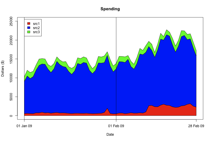
Now that that’s over, let’s just plot the 3 stacked series. The basic technique, as mentioned in the last post, is constructing polygons with our desired boundaries.
And let’s add some prettying up: a legend and X axis labels on the first of the month and the last data point present. Note that this code is generic, so it will work on arbitrary date ranges, including spanning years, date ranges that don’t end on the last day of a month, etc.
1234567891011121314
# x axis labels
labdates <- as.Date('1970-01-01') + min(m2$day):max(m2$day)
labdates <- labdates[ format(labdates, '%d') == '01']
labdates <- unique(c(labdates, max(m2$day)))

labnames <- format(labdates, '%d %b %y')
axis(1, at=labdates, labels=labnames)

# black lines first day of month
for(a in labdates[ format(labdates, '%d') == '01']){
abline(v=a)
}

legend(x=m[1,]$day, y=ylim[2]+500, c('src1', 'src2', 'src3'), fill=c('red', 'blue', 'green'))
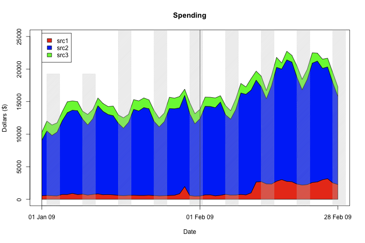
Now, let’s shade the background. What I’m going to do is draw semi transparent grey boxes over Saturday and Sunday. There are a couple issues to be careful of: first, we don’t want to do this over the legend, so we make the first couple of rectangles shorter. Second, we find weekends by looking for Saturday, but the first day of data present could start on Sunday, so we have to check that as well. The rect command draws the specified distance left and right (where -1 equals minus one day, since the data is formatted as Date), as well as top and bottom.
1234567891011121314151617181920
# make the first 3 lower to avoid our legend
cnt <- 0

# set alpha = 80 so it's relatively transparent
color <- rgb(190, 190, 190, alpha=80, maxColorValue=255)

# check if the first data point is a Sunday
m2$dow <- format( m2$day, '%a' )
lhs <- m2[1,'dow']
if(lhs == 'Sun'){
a <- m2[1,]$day
rect(xleft=a-1, xright=a+2 - 1, ybottom=-1000, ytop=1.1*ylim[2] * ifelse(cnt < 2, 0.7, 1), density=100, col=color)
cnt <- cnt + 1
}

# plot 2-day width rectangles on every Saturday
for( a in m2[ m2$dow == 'Sat', ]$day ){
rect(xleft=a-1, xright=a+2 - 0.5, ybottom=-1000, ytop=1.1*ylim[2] * ifelse(cnt < 2, 0.7, 1), density=100, col=color)
cnt <- cnt + 1
}
Finally, I added a quick set of dashed (lty=3) horizontal rules. This makes it much easier to read on projectors. For results, see the first image in this post.