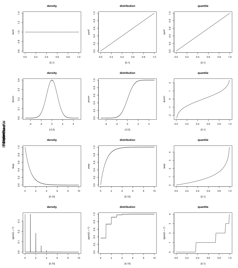
I was helping a friend plot some interesting distributions this weekend, so I decided to use distributions to demonstrate one of the neater bits of R’s basic plotting tools: the ability to easily combine plots into a single plot.
par will allow you to manipulate all sorts of parameters to plots — you should eventually poke through the docs. Nonetheless, one of the simplest things to do is to add plots to a matrix plot. You can specify whether you want these to be row major or column major by using the mfrow or mfcol parameter respectively. Let’s take a look, and play with the uniform distribution while we’re at it:
1 2 3 4 5 6 7 8 9 10 11 | |
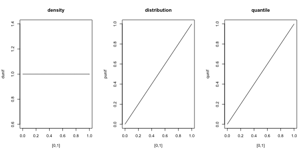
From left to right, we see the density (dunif), distribution (punif) and quantile (quniff) plots for the Uniform[0,1] distribution. The first thing we might wish to do is to add a label to the left side of the combined plot saying what we’re plotting. To do this, we’ll have to adjust the margins for the combined plot, again using par:
1 2 3 4 5 6 7 8 | |
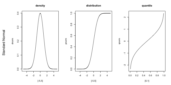
Now, let’s suppose we wanted to use something like a LaTeX expression in our plots — we can do this using expression. For a complete explanation of the syntax, see plotmath.
1 2 3 4 5 6 7 8 9 | |
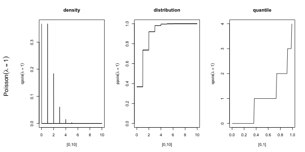
Now that we’ve looked at 3 distributions, say we wanted to look at Uniform[0,1], Standard Normal, Exponential(rate=1) and Poisson(lambda=1) all on the same plot. par will allow us to do that:
1 2 3 4 5 6 7 8 9 10 11 12 13 14 15 16 17 18 19 20 21 22 23 24 25 26 | |

There are a couple issues with this plot, still: there is no main title, the labels we carefully applied with mtext stomped all over each other, and we waste an awful lot of whitespace. Let’s take a stab at fixing all of the above:
1 2 3 4 5 6 7 8 9 10 11 12 13 14 15 16 17 18 19 20 21 22 23 24 25 26 27 28 29 30 31 32 33 | |
