This is post #03 in a running series about plotting in R.
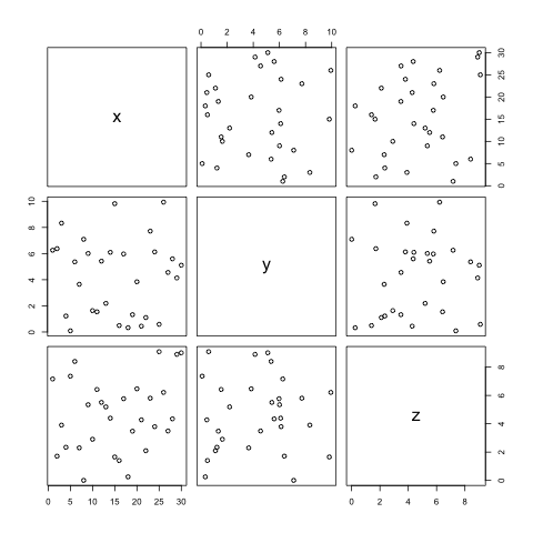
Say you have a data frame with a number of variables that you would like to compare against each other. While you could plot them all on the same graph, statisticians frequently wish to look for visual evidence of correlation between different sets of observations — particularly when looking for visual evidence of heteroskedasticity. A simple way to do this for every variable in a data frame is to call plot on the data frame itself.
Say we have data as such:
1 2 3 4 | |

This is an example of a pairs plot, which I’ll cover in more detail in the future.