This is post #01 in a running series about plotting in R.
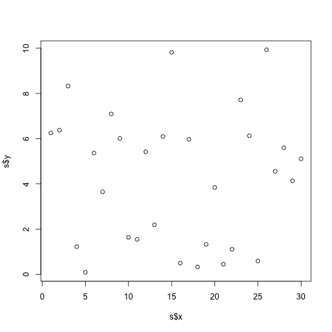
So, say you have some data that you would like to plot in R. In future entries I’ll discuss plotting multiple series, multiple axes, manipulating axis names and formats changing colors or glyphs, saving to disk as png or pdf, time series, highlighting weekends, but for now, let’s throw up a simple graph:
1 2 | |
data: csv

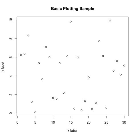
That’s nice, but we could use some better labeling:
1 2 | |

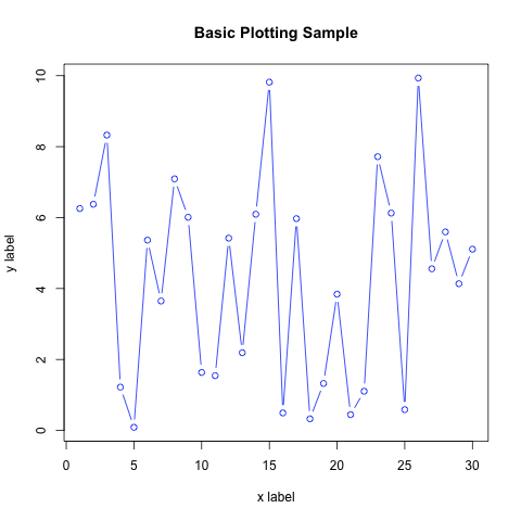
And while we’re messing around, let’s turn out data series blue and plot both dots and connected lines:
1 2 | |

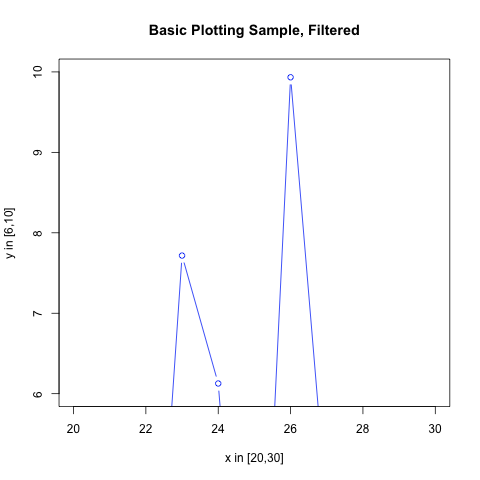
Now finally, we may wish to zoom into a particular piece of the plot. xlim and ylim allow you to override the inferred plotting limits. Let’s examine the upper right corner:
1 2 | |
